AU Content Rating Overlay
The content_rating_au Default Overlay File is used to an overlay based on the Australia Rating on each item within your library.
Requirements & Recommendations
Supported Overlay Level: Movie, Show, Season, Episode
Requirements: Use the Mass Content Rating Update Library Operation with either mdb or omdb to update Plex to the Australia Rating.
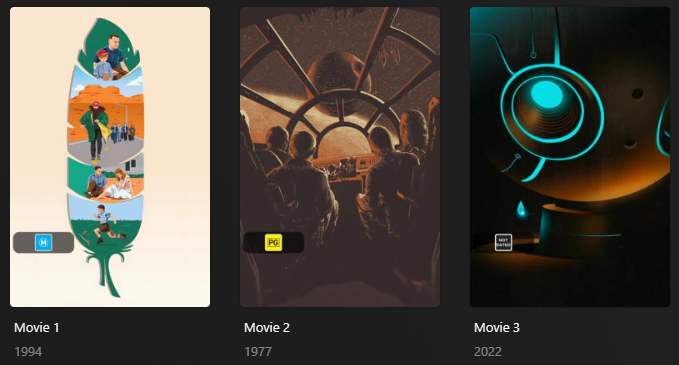
Supported AU Content Ratings
| Rating | Key |
|---|---|
| G | g |
| PG | pg |
| M | m |
| MA15+ | ma |
| R18+ | r |
| X18+ | x |
| NR | nr |
Config
The below YAML in your config.yml will create the overlays:
libraries:
  Movies:
    overlay_files:
      - default: content_rating_au
  TV Shows:
    overlay_files:
      - default: content_rating_au
      - default: content_rating_au
        template_variables:
          builder_level: episode
      - default: content_rating_au
        template_variables:
          builder_level: season
Template Variables
Template Variables can be used to manipulate the file in various ways to slightly change how it works without having to make your own local copy.
Note that the template_variables: section only needs to be used if you do want to actually change how the defaults work.
Any value not specified will use its default value if it has one if not it's just ignored.
Example Template Variable Amendments (Click to Expand)
The below is an example config.yml extract with some Template Variables added in to change how the file works.
Click the icon to learn more
libraries:
  Movies:
    overlay_files:
      - default: content_rating_au
        template_variables:
          color: false #(1)!
- Will set a white variant of the overlay images
-
File-Specific Template Variables are variables available specifically for this Kometa Defaults File.
-
Overlay Template Variables are additional variables shared across the Kometa Overlay Defaults.
Default Template Variable Values (Click to Expand)
| Variable | Default |
|---|---|
horizontal_offset |
15 |
horizontal_align |
left |
vertical_offset |
270 |
vertical_align |
bottom |
back_color |
#00000099 |
back_radius |
30 |
back_width |
305 |
back_height |
105 |
| Variable | Description & Values |
|---|---|
addon_offset |
Description: Text Addon Image Offset from the text. Default: 15Values: Any number greater than 0 |
addon_position |
Description: Text Addon Image Alignment in relation to the text. Default: leftValues: left, right, top, bottom |
builder_level |
Description: Choose the Overlay Level. Values: season or episode |
color |
Description: Color version of the content rating images Default: Set to false if you want b&w version. |
When something in this table is noted as expecting a number, typically that number is expressed in pixels, assuming an image 1000x1500 in size.
If the number is an offset, the value is relative to the corresponding alignment. Percentages are also relative to the alignment.
libraries:
  Movies:
    overlay_files:
      - default: content_rating_au
        template_variables:
          horizontal_align: left
          horizontal_offset: 247
          vertical_align: bottom
          vertical_offset: 40%
libraries:
  Movies:
    overlay_files:
      - default: content_rating_au
        template_variables:
          back_width: 198
          back_height: 47
For example: That would place the content_rating_au overlay 247 pixels in from the left edge of the poster, and 40% of the way up from the bottom.
That would set the content_rating_au overlay background to 198 pixels wide by 47 pixels high.
Color values should be wrapped in quotes in the YAML, as the # denotes a comment in YAML and if left unquoted will prevent the value from being seen by Kometa.
File paths need to be valid in the context where Kometa is running; this is primarily an issue when running in docker, as Kometa inside the container cannot see host paths.
| Variable | Description & Values |
|---|---|
back_align |
Description: Controls the Alignment for the Text Overlay inside the backdrop. If back_align is not specified the Backdrop Centers the text.Values: left, right, center, top, or bottom |
back_color |
Description: Controls the Backdrop Color for the Text Overlay. Values: Color Hex Code in format #RGB, #RGBA, #RRGGBB or #RRGGBBAAAA is transparency; 00 [transparent] to FF [opaque] |
back_height |
Description: Controls the Backdrop Height for the Text Overlay. If back_height is not specified the Backdrop Sizes to the textValues: Any number greater than 0 [pixels assuming a 1000x1500 image] |
back_line_color |
Description: Controls the Backdrop Line Color for the Text Overlay. Values: Color Hex Code in format #RGB, #RGBA, #RRGGBB or #RRGGBBAA``AA is transparency; 00 [transparent] to FF [opaque] |
back_line_width |
Description: Controls the Backdrop Line Width for the Text Overlay. Values: Any number greater than 0 [pixels assuming a 1000x1500 image] |
back_padding |
Description: Controls the Backdrop Padding for the Text Overlay. Values: Any number greater than 0 [pixels assuming a 1000x1500 image] |
back_radius |
Description: Controls the Backdrop Radius for the Text Overlay. Values: Any number greater than 0 [pixels assuming a 1000x1500 image] |
back_width |
Description: Controls the Backdrop Width for the Text Overlay. If back_width is not specified the Backdrop Sizes to the textValues: Any number greater than 0 [pixels assuming a 1000x1500 image] |
file_<<key>> |
Description: Controls the image associated with this key's Overlay to a local file. Values: Filepath to Overlay Image |
file |
Description: Controls the images associated with all the Overlays to a local file. Values: Filepath to Overlay Image |
git_<<key>> |
Description: Controls the image associated with this key's Overlay to the git repo. Values: Git Path to Overlay Image |
git |
Description: Controls the images associated with all the Overlays to the git repo. Values: Git Path to Overlay Image |
horizontal_align |
Description: Controls the Horizontal Alignment of the overlay. Values: left, center, or right |
horizontal_offset |
Description: Controls the Horizontal Offset of this overlay. Can be a %. Values: Number 0 or greater or 0%-100% [pixels assuming a 1000x1500 image] |
repo_<<key>> |
Description: Controls the image associated with this key's Overlay to a custom repo. Values: Repo Path to Overlay Image |
repo |
Description: Controls the images associated with all the Overlays to a custom repo. Values: Repo Path to Overlay Image |
url_<<key>> |
Description: Controls the image associated with this key's Overlay to a url. Values: URL to Overlay Image |
url |
Description: Controls the images associated with all the Overlays to a url. Values: URL to Overlay Image |
use_<<key>> |
Description: Turns off individual Overlays in a Defaults File. Values: false to turn off the overlay |
vertical_align |
Description: Controls the Vertical Alignment of the overlay. Values: top, center, or bottom |
vertical_offset |
Description: Controls the Vertical Offset of this overlay. Can be a %. Values: Number 0 or greater or 0%-100% [pixels assuming a 1000x1500 image] |
Default Value Source
This is a reference showing the source of the data used in this Defaults File.
Nothing in this section is required for using the Defaults File, but it can be useful for understanding where the data comes from.
Nothing in this section is directly useful for customizing this Defaults File.
Nothing here is a code example for end user use. It all looks like code, since it is taken directly from the Kometa source code to ensure it is up-to-date and accurate, but it is not intended for end user use, and is expressed in a different format to the way you would customize the defaults via Template Variables.
I want to customize this default
To learn how to customize any Defaults File using Template Variables see the Defaults Usage Guide.
Each Defaults File has its own set of Template Variables, which are used to control the behavior of that default. The Template Variables for this file can be found here.
I want to know what's behind the defaults
The lists provided here are for reference to show what values will be in use if no customization is done.
These do not show how to customize the defaults.
Nothing here is a code example for end user use. It all looks like code, since it is taken directly from the Kometa source code to ensure it is up-to-date and accurate, but it is not intended for end user use.
These lists are provided for reference only.
If you want to customize these collections, refer to the Defaults Usage Guide to learn how to use Template Variables.
The AU Content Rating overlays use the plex_search Builder with filters on a set of content ratings and map them into a single content rating as requested.